Fast
To attract and retain today's users, a website must engage the visitor with a fast-loading, attractive web page.
Mobile-friendly
Interon Design focuses on mobile responsiveness and compatibility with all major devices and browsers.
Easy to use
Our websites prioritize the user experience.They are fast-loading and accessible.
SEO-friendly
We use web design best practices from the start to help your website get found on search engines.
about this website
You probably noticed that this website is pretty simple.
It looks like this for a reason. I wanted to use this site to illustrate the point that you can have an easy to use design that is clean, cohesive, and attractive across any number of platforms, from mobile, to tablets, to desktops.
I wanted to create something that takes my design philosophy of less is more to a higher degree than usual. It is an exercise of sorts to see how few resources I can utilize in the construction, and how fast can I make it all download.
K.I.S.S.
There is really very little going on here. There is only one image on the page-the logo at the bottom. While the interon design at the top looks like it could be a logo, it is in fact text. The font selected matches the actual interon design logo and has been styled with extra spacing between the letters, just like the logo.
The and in the page footer and elsewhere might look like graphics, but they too are fonts, albeit one that yields icons instead of letters. These icon fonts are used to lend visual interest and visual cues, but they download much faster than graphics.
The design of the page yields no surprises, and that is a good thing. Visitors hate surprises. They don't want to have to learn something new. They want their experience on one site to be just like their experiences on other sites. That is why the company name is at the top left. That is why the navigation is laid out horizontally across the top, and that is why the main content of the page is on the left.
Speed is a Rankings Factor
Visitors like fast websites. Therefore Google likes fast web sites. Download speed is one of the many factors Google utilizes to rank websites on their search results page. In fact, Google has a service called PageSpeed Insights , which allows webmasters (or anyone else for that matter) to enter a web address and receive a score for the speed of the page when viewed in both mobile and desktop browsers.
By making this site clean and simple, and following a number of design and development best practices, the site scores 100/100 in PageSpeed Insights for Desktop PC's.
PageSpeed Insights Score for home page - Desktop
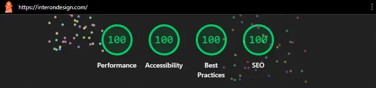
PageSpeed Insights Score for home page - Mobile

The Download Speed Details
This page utilizes the following files to create the home page:
| File Type | File Name | Size (kb) | Download Speed (ms) |
|---|---|---|---|
| HTML | index.html | 22.0 kb | 263 ms |
| Font | Material Icon subset | 1.6 kb | 175 ms |
| Font | Quicksand Variable font | 22.5 kb | 175 ms |
| CSS | output.css | 6.0 kb | 98 ms |
| Image | id3.webp | 3.3 kb | 96 ms |
| Favicon | favicon.ico | 1.12 kb | 1 ms |
| JavaScript | link-conversion.js | 0.3 kb | 92 ms |
| JavaScript | googletagmanager.com/gtag/js | 149 kb | 180 ms |
| Total: | 205.82 kb | 1.08 seconds |
The eight file requests that render the site home page total 205.82 kb in size, and require only 1.08 seconds for ALL files to download for the first time on desktop machines.
However, as impressive as that is, there are three important speed metrics measured that have a considerable bearing on the performance score. They are:
1. First Contentful Paint (FCP)
0.4 seconds
First Contentful Paint marks the elapsed time it takes the first text or image to appear in the browser.
So in other words, the first element of the Interon Design home page appears on screen in 0.4 seconds, indicating to the visitor that the site is doing something.
2. Largest Contentful Paint (LCP)
0.5 seconds
Largest Contentful Paint (LCP) measures when the largest content element in the viewport is rendered to the screen. This approximates when the main content of the page is visible to users.
Then, in another 0.1 seconds the largest element appears onscreen, which
in practice is the above the fold
portion of the web page, making it look like the entire page has
downloaded in just .5 seconds. In reality the unseen portion of the page takes another .58 seconds (making it
1.08 seconds in total) until the entire page has downloaded.
3. Speed Index
0.5 seconds
Speed Index measures how quickly content is displayed during page load.
Summary
This website is an exercise in simplicity, speed and standards compliance. As my work can attest, that doesn't mean your site will be an experiment like this one, but it does mean that same philosophy will be applied in order to maximize the visitors user experience and the site's exposure on Google.
After working with interon design for less than a week, our website was up and running. Our exposure since then has been unbelievable. Thanks John for giving a small business like us the ability to grow so much for such a small investment.— Michael Hyman, Vice President,
Personal Touch Coding